1. pyplot模块
1.1. matplotlib.pyplot.plot
1.1.1. color的值
| character | color |
|---|---|
'b' | blue |
'g' | green |
'r' | red |
'c' | cyan |
'm' | magenta |
'y' | yellow |
'k' | black |
'w' | white |
1.1.2. Marker的值
| character | description |
|---|---|
'.' | point marker |
',' | pixel marker |
'o' | circle marker |
'v' | triangle_down marker |
'^' | triangle_up marker |
'<' | triangle_left marker |
'>' | triangle_right marker |
'1' | tri_down marker |
'2' | tri_up marker |
'3' | tri_left marker |
'4' | tri_right marker |
's' | square marker |
'p' | pentagon marker |
'*' | star marker |
'h' | hexagon1 marker |
'H' | hexagon2 marker |
'+' | plus marker |
'x' | x marker |
'D' | diamond marker |
'd' | thin_diamond marker |
'|' | vline marker |
'_' | hline marker |
1.1.3. LineStyles的值
| character | description |
|---|---|
'-' | solid line style |
'--' | dashed line style |
'-.' | dash-dot line style |
':' | dotted line style |
例子:
'b'    # blue markers with default shape
'ro'   # red circles
'g-'   # green solid line
'--'   # dashed line with default color
'k^:'  # black triangle_up markers connected by a dotted line
2. 示例
2.1. 简单的plot()方法使用
import matplotlib.pyplot as plt
import numpy as np

def zhexiantu():
    '''
    简单的plot使用
    '''

    x = np.array([1, 2, 3, 4, 5, 6, 7, 8])
    y = np.array([3, 5, 7, 6, 2, 6, 10, 15])
	#x, y可以是列表
    plt.plot(x, y, color='red', marker='o', linewidth=1.0, linestyle='-')
    # color和marker可以合并省略,如下所示,效果是一样
    # plt.plot(x, y, 'ro',  lw=1.0, ls='-')
    plt.show()
2.2. 函数的画法
跟plot的使用差不多,只是需要的数据量很大
import matplotlib.pyplot as plt
import numpy as np

def hanshu():
    '''
    画函数图像
    '''
    # linspace 指定开始、结束、数的个数
    # 从-1-----1之间等间隔采66个数.也就是说所画出来的图形是66个点连接得来的
    # 注意:如果点数过小的话会导致画出来二次函数图像不平滑
    x = np.linspace(-1, 1, 66)
    y1 = 2 * x + 1
    y2 = x ** 2

    plt.plot(x, y1)
    plt.show()

    plt.plot(x, y2)
    plt.show()
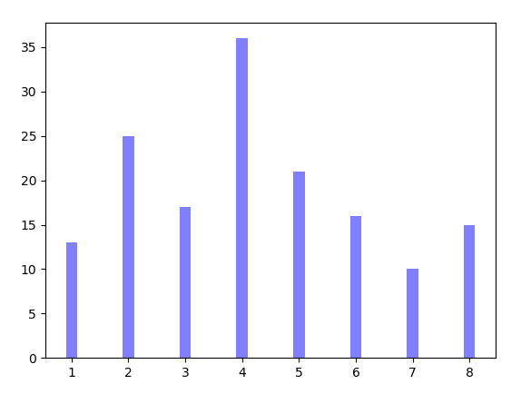
2.3. 柱状图的画法
import matplotlib.pyplot as plt
import numpy as np
def barPicture():
'''
柱状图的画法
'''
'''1.简单的'''
x = np.array([1,2,3,4,5,6,7,8])
y = np.array([13,25,17,36,21,16,10,15])
plt.bar(x, y, 0.2, alpha=0.5 ,color="b")
plt.show()
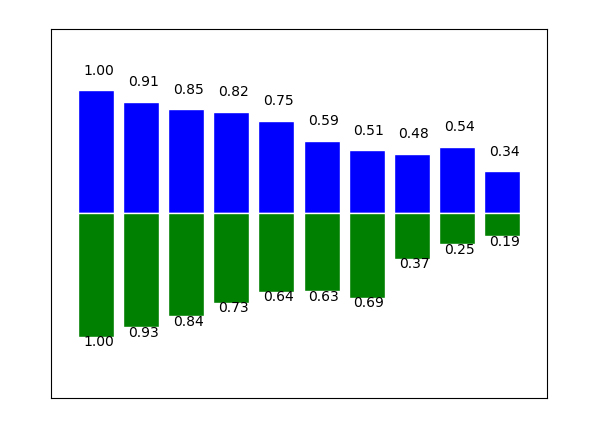
'''2.复杂的'''
# x = np.arange(10)
# y1 = (1 - x / float(10) * np.random.uniform(0.5, 1.0, 10))
# y2 = (1 - x / float(10) * np.random.uniform(0.5, 1.0, 10))
#
# # 绘制柱状图,向上
# plt.bar(x, y1, facecolor='blue', edgecolor='white')
# # 绘制柱状图,向下
# plt.bar(x, -y2, facecolor='green', edgecolor='white')
#
# # 进行标注
# for x, y1, y2 in zip(x, y1, y2):
# plt.text(x + 0.05, y1 + 0.1, '%.2f' % y1, ha='center', va='bottom')
# plt.text(x + 0.05, -y2 - 0.1, '%.2f' % y2, ha='center', va='bottom')
#
# # 设置x和y轴的坐标范围
# plt.xlim(-1, 10)
# plt.ylim(-1.5, 1.5)
# # 设置x和y轴的坐标显示为空
# plt.xticks(())
# plt.yticks(())
#
# plt.show()
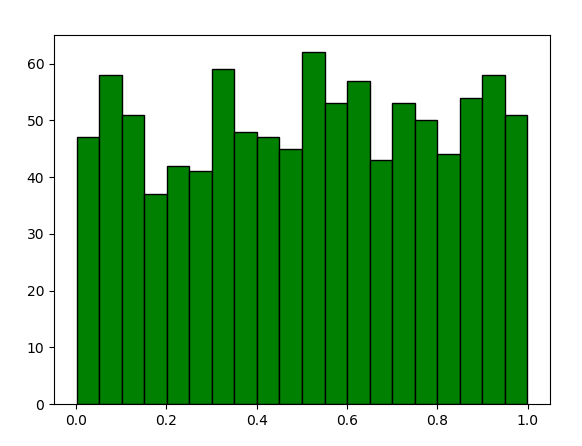
2.4. 直方图的画法
import matplotlib.pyplot as plt
import numpy as np

def histUse():
    '''
    直方图的画法
    '''

    p = np.random.rand(1000)

    # bins 表示分为20个类
    plt.hist(p, bins=20, color='g', edgecolor='k')
    plt.show()
2.5. 散点图
import matplotlib.pyplot as plt
import numpy as np

def scatterUse():
    '''
    散点图
    '''

    x = np.random.normal(0, 1, 1024)
    y = np.random.normal(0, 1, 1024)

    color = np.arctan2(y, x)
    # 绘制散点图
    plt.scatter(x, y, s=75, c=color, alpha=0.5)

    # 设置坐标轴范围
    plt.xlim((-1.5, 1.5))
    plt.ylim((-1.5, 1.5))

    # 不显示坐标轴的值
    plt.xticks(())
    plt.yticks(())
    plt.show()

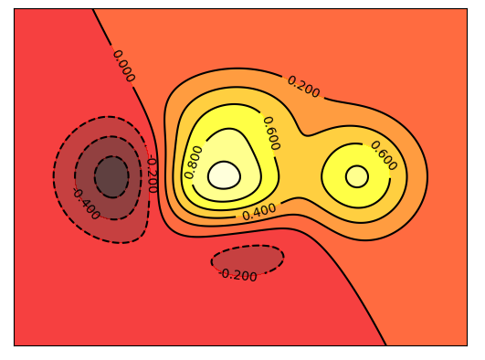
2.6. 等高线
import matplotlib.pyplot as plt
import numpy as np

def meanHigh():
    '''
    等高线图
    '''

    x = np.linspace(-3, 3, 256)
    y = np.linspace(-3, 3, 256)

    # 生成网格数据
    X, Y = np.meshgrid(x, y)

    # 填充等高线的颜色,8是等高线分成几部分
    plt.contourf(X, Y, (1 - X / 2 + X ** 5 + Y ** 3) * np.exp(- X ** 2 - Y ** 2),
                 8, alpha=0.75, cmap=plt.cm.hot)
    # 绘制等高线
    C = plt.contour(X, Y, (1 - X / 2 + X ** 5 + Y ** 3) * np.exp(- X ** 2 - Y ** 2),
                    8, colors='black', lw=0.5)
    # 添加数值
    plt.clabel(C, inline=True, fontsize=10)

    plt.xticks(())
    plt.yticks(())
    # 绘制等高线数据
    plt.show()
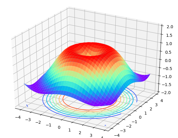
2.7. 3D立体图的画法
import matplotlib.pyplot as plt
import numpy as np
from mpl_toolkits.mplot3d import Axes3D

def d3Picture():
    '''
    3D图形绘制
    '''

    x = np.arange(-4, 4, 0.25)
    y = np.arange(-4, 4, 0.25)
    X, Y = np.meshgrid(x, y)

    # 计算每个点对的长度
    R = np.sqrt(X ** 2 + Y ** 2)
    # 计算Z轴的高度
    Z = np.sin(R)

    fig = plt.figure()
    # 将figure变为3d
    ax = Axes3D(fig)  # type:mpl_toolkits.mplot3d.Axes3D

    # 绘制3D曲面
    ax.plot_surface(X, Y, Z, rstride=1, cstride=1, cmap=plt.get_cmap('rainbow'))
    # 绘制从3D曲面到底部的投影
    ax.contour(X, Y, Z, zdim='z', offset=-2, cmap='rainbow')
    # 设置z轴的维度
    ax.set_zlim(-2, 2)

    plt.show()
2.8. figure的使用
import matplotlib.pyplot as plt
import numpy as np

def figureUse():
    '''
    figure的使用
    '''
    x = np.linspace(-1, 1, 50)
    y1 = 2 * x * 1
    y2 = x ** 2

    plt.figure()
    plt.plot(x, y1)

    # 将会创建另外一个figure来显示图片
    plt.figure()
    plt.plot(x, y2)

    plt.show()
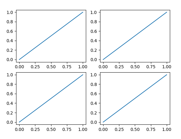
2.9. subplot绘制子图
import matplotlib.pyplot as plt
def subplotUse1():
'''
subplot在一个figure中绘制多个子图
'''
plt.figure()
# 绘制第一个子图
plt.subplot(2, 2, 1)
plt.plot([0, 1], [0, 1])
# 绘制第二个子图
plt.subplot(2, 2, 2)
plt.plot([0, 1], [0, 1])
# 绘制第三个子图
plt.subplot(2, 2, 3)
plt.plot([0, 1], [0, 1])
# 绘制第四个子图
plt.subplot(2, 2, 4)
plt.plot([0, 1], [0, 1])
plt.show()
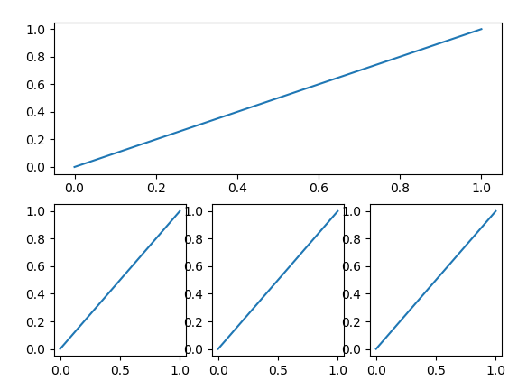
def subplotUse2():
'''
subplot在一个figure中绘制多个子图
'''
plt.figure()
# 绘制第一个子图
plt.subplot(2, 1, 1)
plt.plot([0, 1], [0, 1])
# 绘制第二个子图
plt.subplot(2, 3, 4)
plt.plot([0, 1], [0, 1])
# 绘制第三个子图
plt.subplot(2, 3, 5)
plt.plot([0, 1], [0, 1])
# 绘制第四个子图
plt.subplot(2, 3, 6)
plt.plot([0, 1], [0, 1])
plt.show()
2.10. figure绘制子图
import matplotlib.pyplot as plt
import numpy as np
import matplotlib.gridspec as gridspec

def duoTuUse1():
    '''
    figure绘制多个子图,采用subplot2grid
    '''

    plt.figure()
    # figure分成3行3列,取得第一个子图的句柄,
    # 第一个子图跨度为1行3列,起点是表格(0, 0)
    ax1 = plt.subplot2grid((3, 3), (0, 0), colspan=3, rowspan=1)
    ax1.plot([0, 1], [0, 1])
    ax1.set_title('Test')

    ax2 = plt.subplot2grid((3, 3), (1, 0), colspan=2, rowspan=1)
    ax2.plot([0, 1], [0, 1])

    ax3 = plt.subplot2grid((3, 3), (1, 2), colspan=1, rowspan=1)
    ax3.plot([0, 1], [0, 1])

    ax4 = plt.subplot2grid((3, 3), (2, 0), colspan=3, rowspan=1)
    ax4.plot([0, 1], [0, 1])

    plt.show()


def duoTuUse2():
    '''
    figure绘制多图,gridspec
    '''

    plt.figure()
    # 分割figure
    gs = gridspec.GridSpec(3, 3)
    ax1 = plt.subplot(gs[0, :])
    ax2 = plt.subplot(gs[1, 0:2])
    ax3 = plt.subplot(gs[1, 2])
    ax4 = plt.subplot(gs[2, :])

    ax1.plot([0, 1], [0, 1])
    ax1.set_title('Test')
    ax2.plot([0, 1], [0, 1])
    ax3.plot([0, 1], [0, 1])
    ax4.plot([0, 1], [0, 1])

    plt.show()

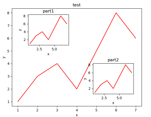
2.11. figure图的嵌套
import matplotlib.pyplot as plt
import numpy as np

def inFigure():
    '''
    figure图的嵌套
    '''

    fig = plt.figure()
    x = [1, 2, 3, 4, 5, 6, 7]
    y = [1, 3, 4, 2, 5, 8, 6]

    # figure的位置,left和bottom指定了图真正开始的位置,从figure 10%的位置开始
    # width和height指定的是图真正的大小,是figure的80%
    left, bottom, width, height = 0.1, 0.1, 0.8, 0.8
    # 获得绘制的句柄
    ax1 = fig.add_axes([left, bottom, width, height])
    # 绘制点
    ax1.plot(x, y, 'r')
    ax1.set_xlabel('x')
    ax1.set_ylabel('y')
    ax1.set_title('test')

    # 嵌套方法一
    left, bottom, width, height = 0.2, 0.6, 0.25, 0.25
    ax2 = fig.add_axes([left, bottom, width, height])
    ax2.plot(x, y, 'r')
    ax2.set_xlabel('x')
    ax2.set_ylabel('y')
    ax2.set_title('part1')

    # 嵌套方法二
    plt.axes([0.6, 0.2, 0.25, 0.25])
    plt.plot(x, y, 'r')
    plt.xlabel('x')
    plt.ylabel('y')
    plt.title('part2')

    plt.show()
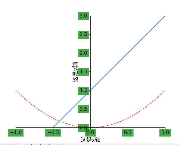
2.12. 坐标轴的相关操作
import matplotlib.pyplot as plt
import numpy as np

def axisUse():
    '''
    坐标轴的相关操作
    '''

    x = np.linspace(-1, 1, 50)
    y1 = x * 2 + 1
    y2 = x ** 2

    plt.figure()
    plt.plot(x, y1)
    plt.plot(x, y2, 'red', lw=1.0, ls='--')

    # 设置坐标轴的取值范围
    plt.xlim((-1, 1))
    plt.ylim((0, 3))

    # 设置坐标轴的lable
    # 标签里面必须添加字体变量:fontproperties='SimHei',fontsize=14。不然可能会乱码
    plt.xlabel('这是x轴', fontproperties='SimHei', fontsize=14)
    plt.ylabel('这是y轴', fontproperties='SimHei', fontsize=14)

    # 设置x坐标轴刻度, 之前为0.25, 修改后为0.5
    # 也就是在坐标轴上取5个点,x轴的范围为-1到1所以取5个点之后刻度就变为0.5了
    plt.xticks(np.linspace(-1, 1, 5))
    # 获取当前的坐标轴
    ax = plt.gca()
    # 设置右边框和上边框
    ax.spines['right'].set_color('none')
    ax.spines['top'].set_color('none')
    # 设置x坐标轴为下边框
    ax.xaxis.set_ticks_position('bottom')
    # 设置y坐标轴为左边框
    ax.yaxis.set_ticks_position('left')
    # 设置x轴,y轴在(0, 0)的位置
    ax.spines['bottom'].set_position(('data', 0))
    ax.spines['left'].set_position(('data', 0))
    for label in ax.get_xticklabels() + ax.get_yticklabels():
        label.set_fontsize(12)
        label.set_bbox(dict(facecolor='g', edgecolor='None', alpha=0.7))
    plt.show()
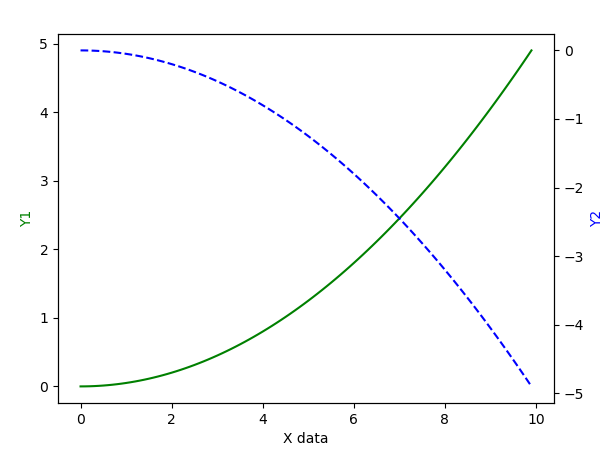
2.13. 主次坐标轴
import matplotlib.pyplot as plt
import numpy as np

def zhuciaxis():
    '''
    主次坐标轴
    '''

    x = np.arange(0, 10, 0.1)
    y1 = 0.05 * x ** 2
    y2 = -1 * y1

    # 定义figure
    fig, ax1 = plt.subplots()
    # 得到ax1的对称轴ax2
    ax2 = ax1.twinx()
    # 绘制图像
    ax1.plot(x, y1, 'g-')
    ax2.plot(x, y2, 'b--')
    # 设置label
    ax1.set_xlabel('X data')
    ax1.set_ylabel('Y1', color='g')
    ax2.set_ylabel('Y2', color='b')

    plt.show()
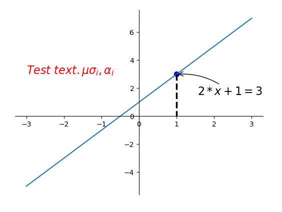
2.14. 注解的使用
import matplotlib.pyplot as plt
import numpy as np

def zhujie():
    '''
    注解的使用
    '''

    x = np.linspace(-3, 3, 50)
    y = 2 * x + 1
    plt.figure()
    plt.plot(x, y)

    ax = plt.gca()
    ax.spines['right'].set_color('none')
    ax.spines['top'].set_color('none')
    ax.xaxis.set_ticks_position('bottom')
    ax.yaxis.set_ticks_position('left')

    ax.spines['bottom'].set_position(('data', 0))
    ax.spines['left'].set_position(('data', 0))

    # 定义(x0, y0)点
    x0 = 1
    y0 = 2 * x0 + 1
    # 绘制(x0, y0)点
    plt.scatter(x0, y0, s=50, color='blue')
    # 绘制垂线
    plt.plot([x0, x0], [y0, 0], 'k--', lw=2.5)
    # 注解形式一
    plt.annotate('$2 * x + 1 = %s$' % y0, xy=(x0, y0), xycoords='data', xytext=(+30, -30),
                 textcoords='offset points', fontsize=16,
                 arrowprops=dict(arrowstyle='->', connectionstyle='arc3, rad=.2'))
    # 注解形式二
    plt.text(-3, 3, r'$Test\ text. \mu \sigma_i, \alpha_i$', fontdict={'size': 16, 'color': 'red'})
    plt.show()
2.15. Image的绘制
import matplotlib.pyplot as plt
import numpy as np

def imgPaint():
    '''
    Image绘制
    '''
    # 定义图像数据
    a = np.linspace(0, 1, 9).reshape(3, 3)
    # 显示图像数据
    plt.imshow(a, interpolation='nearest', cmap='bone', origin='lower')
    # 添加颜色条
    plt.colorbar()
    # 去掉坐标轴
    plt.xticks(())
    plt.yticks(())
    plt.show()

本文参考: